The Problem
The feature existed. It just wasn't built for the field.
AgroScout's mobile app let agronomists and field managers photograph crop diseases, damage, and anomalies, with each photo tied to a GPS location on the map. The feature was there. People were using it.
But using it meant fighting conditions the product had never accounted for: direct sunlight making the screen unreadable, unstable or absent connectivity in remote fields, a flow with too many steps for something that needed to happen in seconds, and no way to document the small, precise details that often matter most.
The product had been designed for a screen. The users were standing in a field.
The Insight
The friction wasn't in one place. It was in the assumptions.
User interviews and Heap data surfaced the same pattern across different users and different fields. The problem wasn't one broken step in the flow. It was the entire set of assumptions baked into the design: that users would have steady hands, good lighting, reliable internet, and time to tap through multiple screens.
None of those were true in practice. The redesign had to start from actual field conditions, not ideal ones.
Small buttons and low-contrast elements became unreadable outdoors. Users were guessing where to tap.
Uploads failed mid-field with no clear feedback. Users didn't know if their documentation had been saved or lost.
A task that needed to take seconds was taking too long. In a working day full of field visits, every extra tap added up.
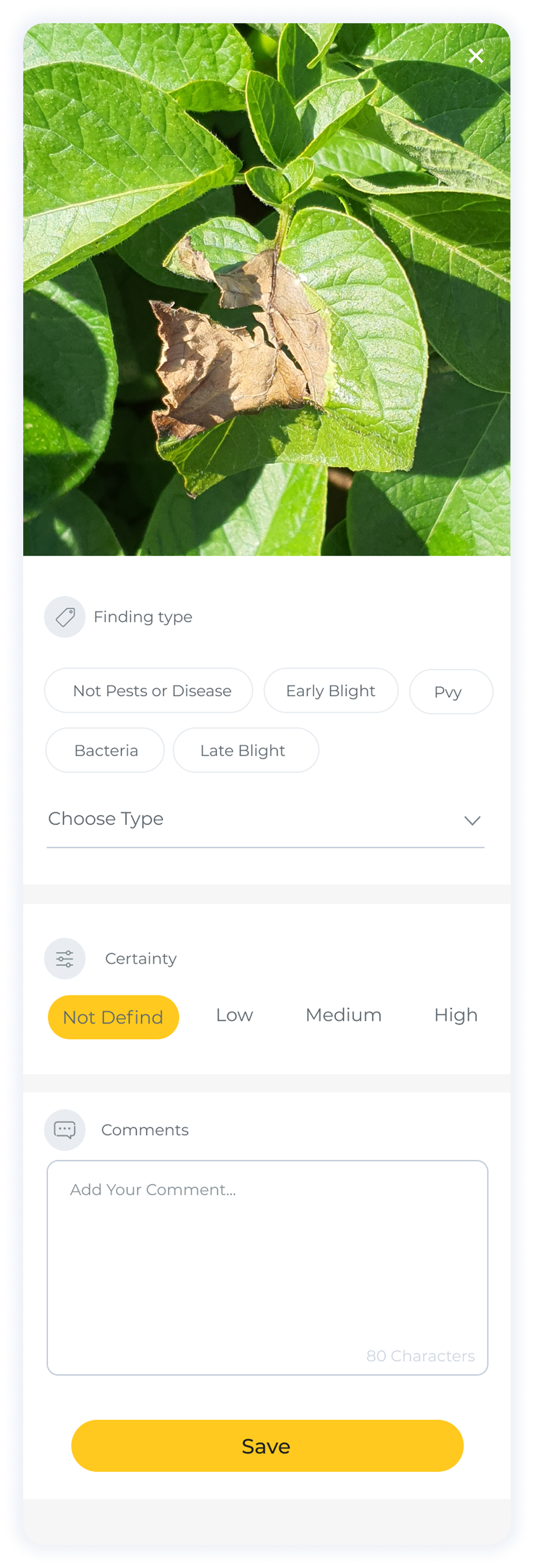
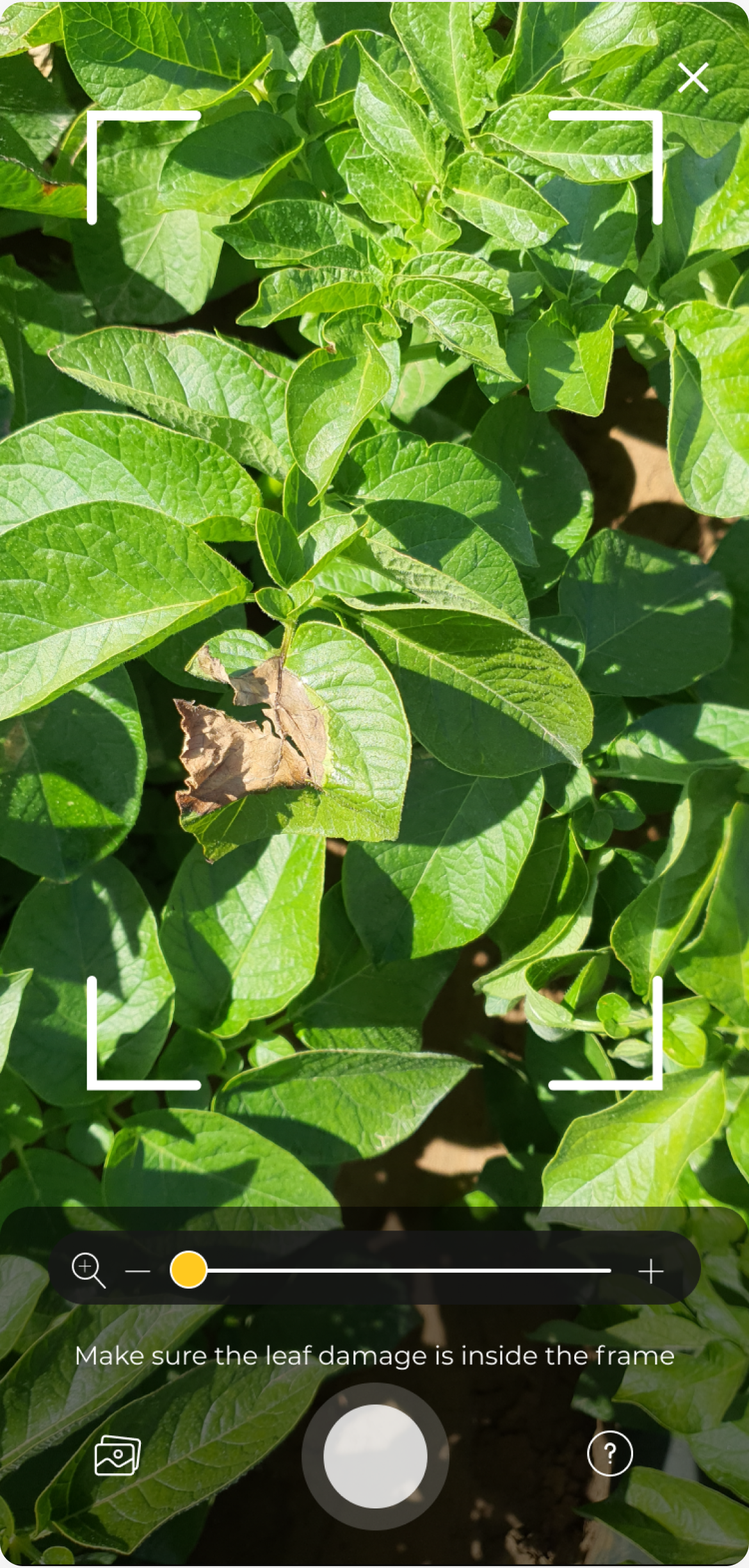
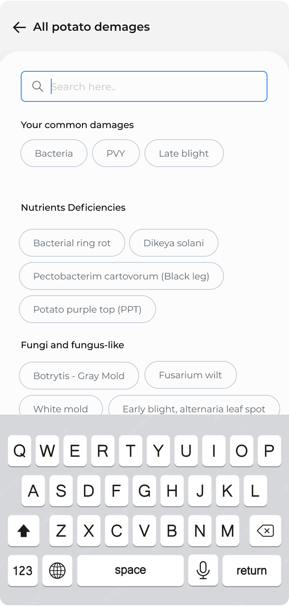
Agronomists need to document early-stage damage and precise disease spots. The standard camera gave them no control over that.
The Approach
Design for the worst conditions, and it works in all of them.
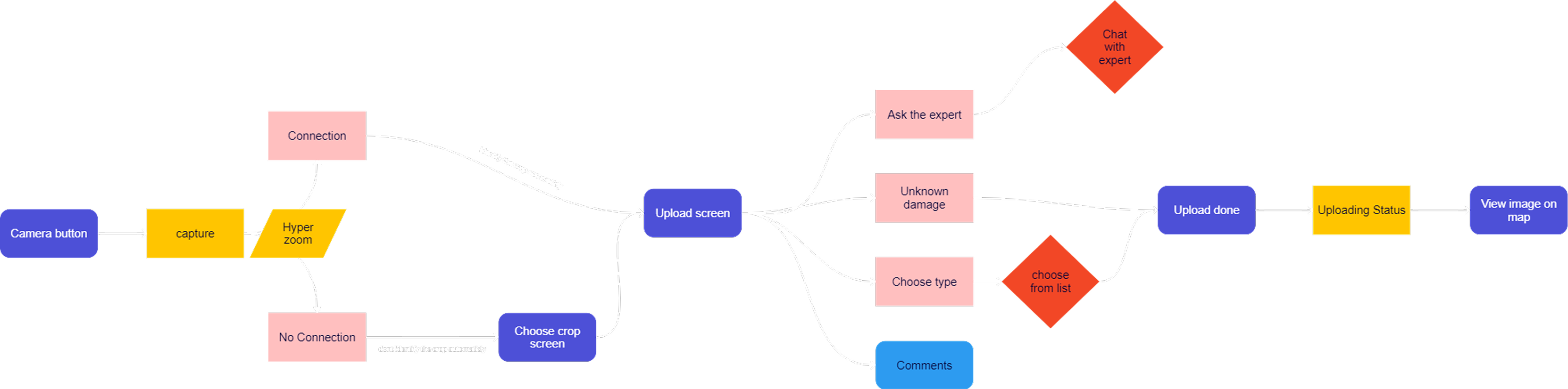
The core design principle: stop optimizing for the ideal scenario and start designing for the realistic one. That meant rethinking the flow from the moment a user opens the camera to the moment the photo is confirmed as saved.
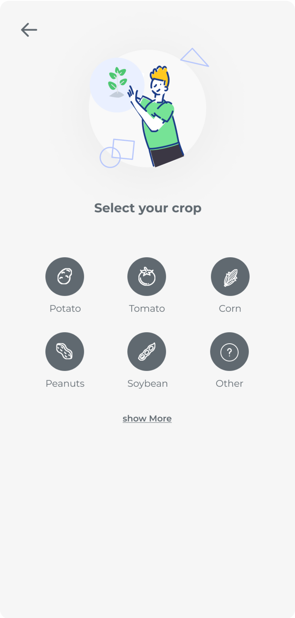
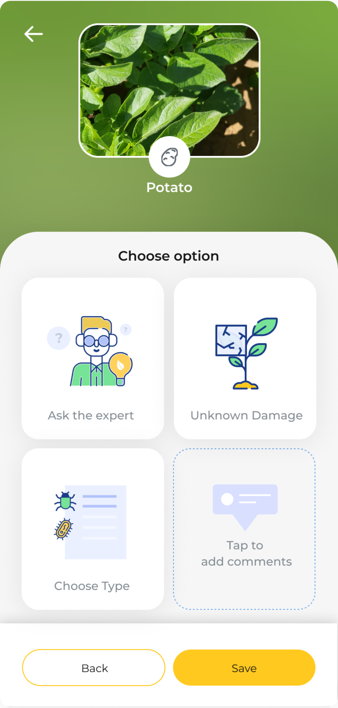
Reduced to the minimum number of taps required. Every step that didn't serve the user in the field was removed or deferred.
Larger, higher-contrast touch targets built for sunlight and movement. The interface needed to work in bright light, with one hand.
Added zoom capability for capturing small-scale damage and early-stage disease indicators, the details agronomists actually need to document.
Photos save locally and upload automatically when connectivity returns. Clear status so users always know what's saved and what's pending.
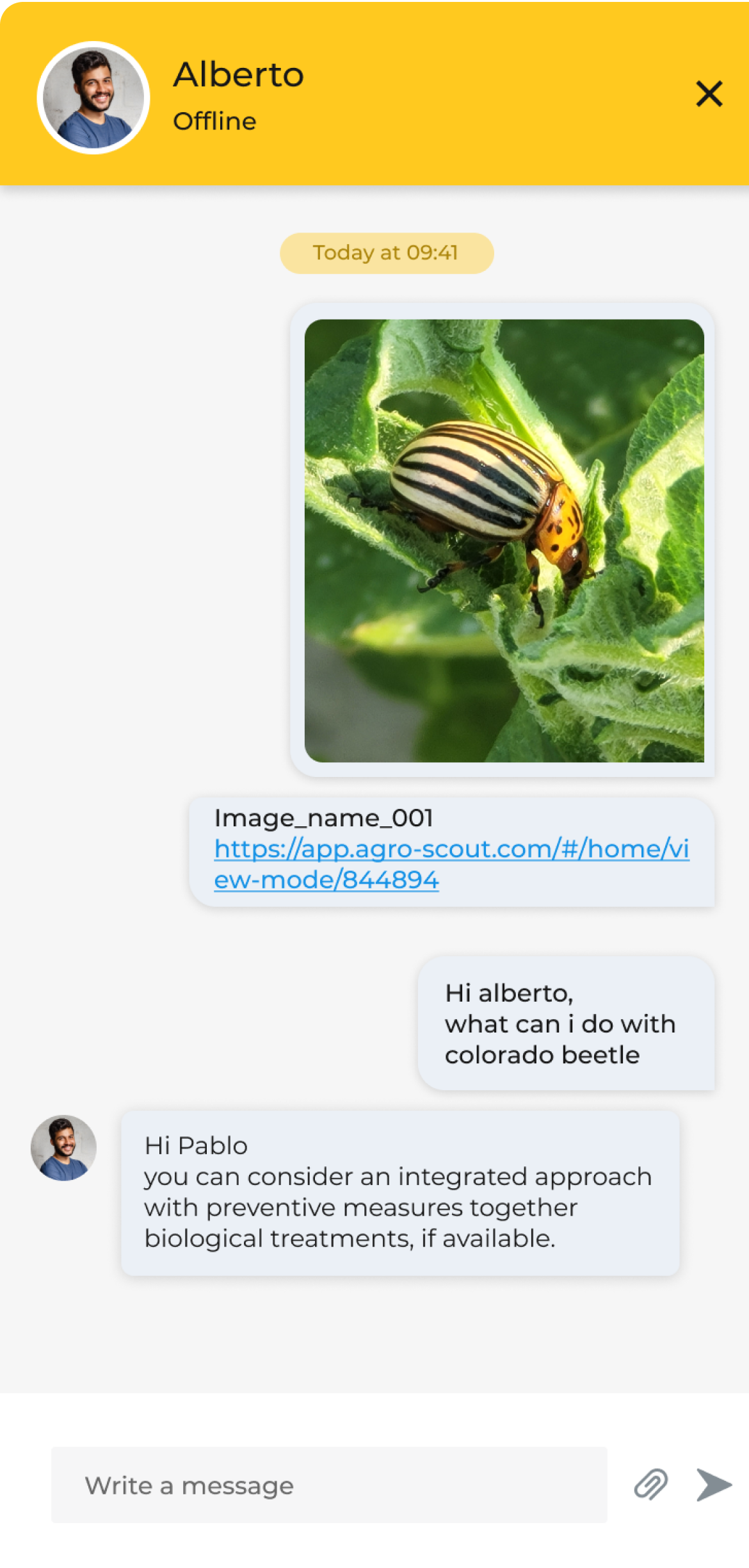
Added the ability to message an agronomist directly from within the upload process. When a finding is unclear, users get a second opinion without leaving the context of what they just photographed.
The Design
Tap through the flow.
Seven screens. Each decision visible in context.
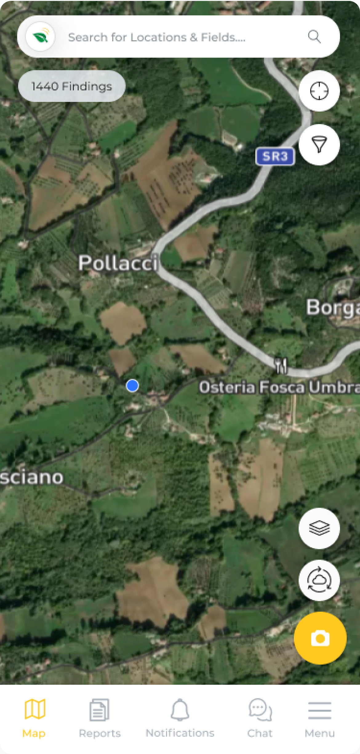
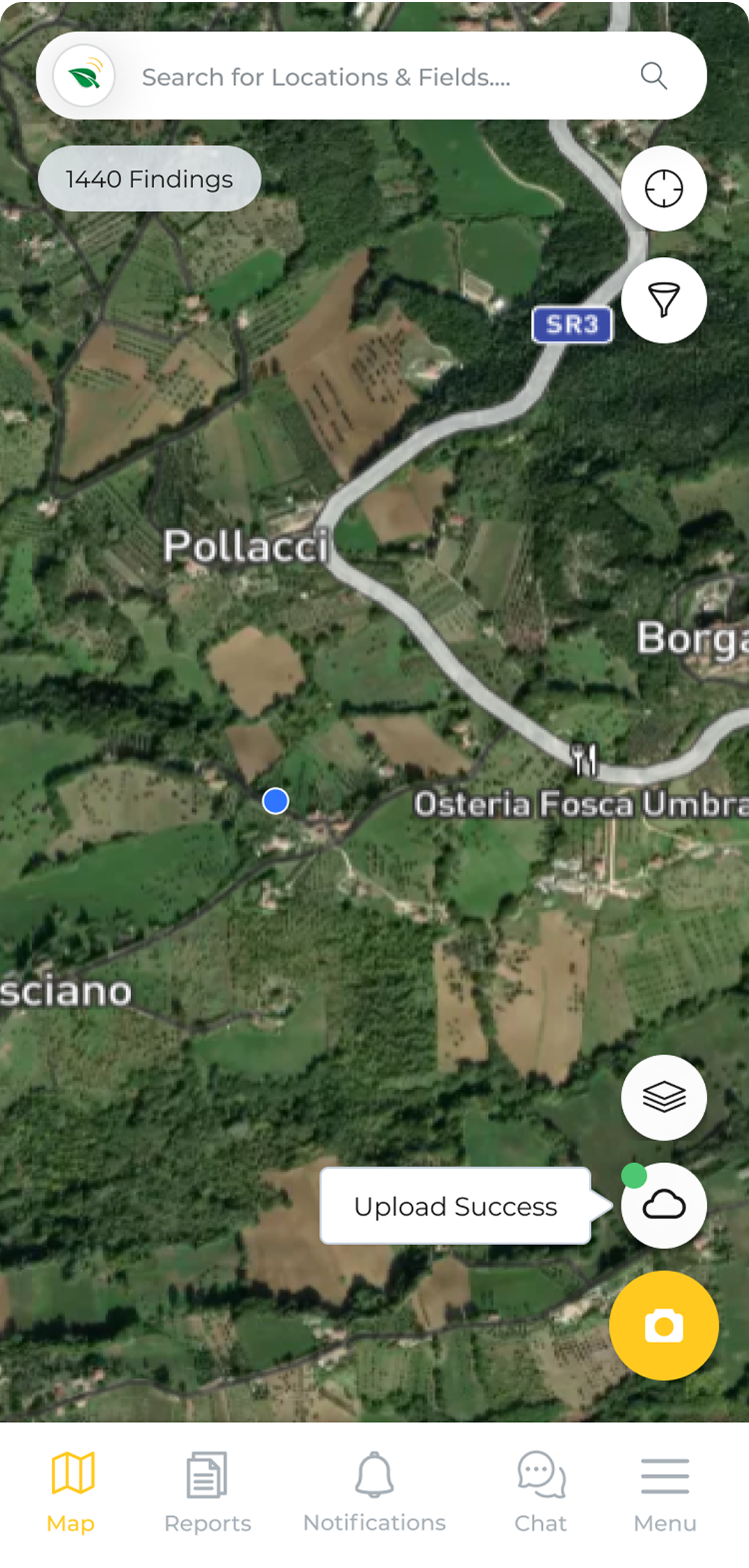
Start from the map
Tap the camera button to begin documenting.
Outcome
A flow that works because it was built for where it's actually used.
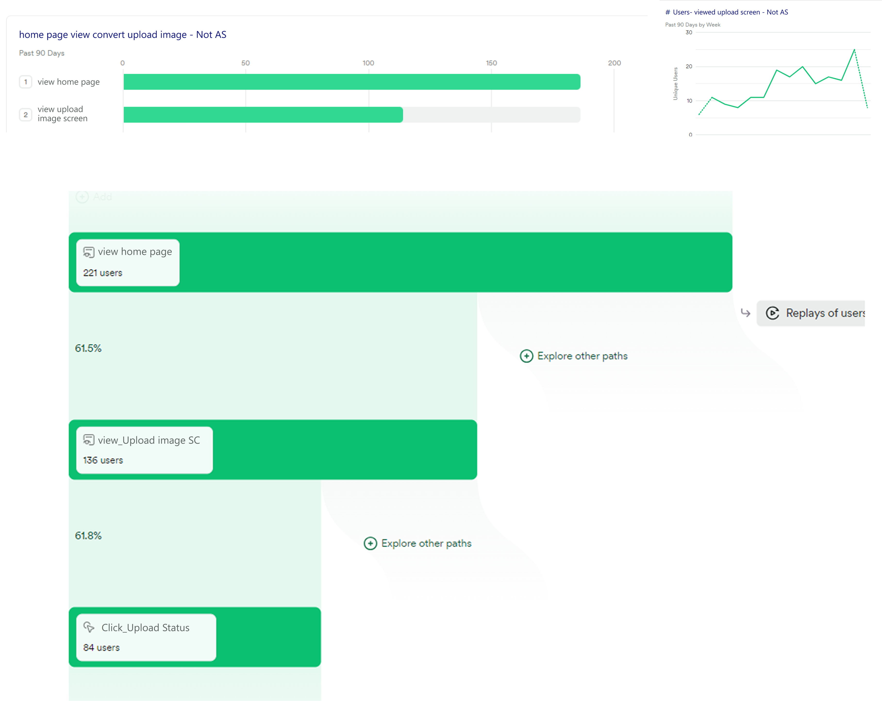
Heap tracking gave us a clear signal on what users needed most. Of the users who reached the upload screen, 61.8% engaged with the upload status feature — the one we built specifically for the offline problem. Users weren't just completing the flow. They were actively using the parts we built to solve the hardest constraints.
The flow was rebuilt around the minimum viable number of taps for a field context. Everything else was removed or deferred.
Photos save locally the moment they're taken. The upload queue handles connectivity without any action from the user.
The agronomist chat sits inside the upload flow. The finding and the conversation live in the same place.