The Problem
Five percent. That's how many users were engaging with Recommendations.
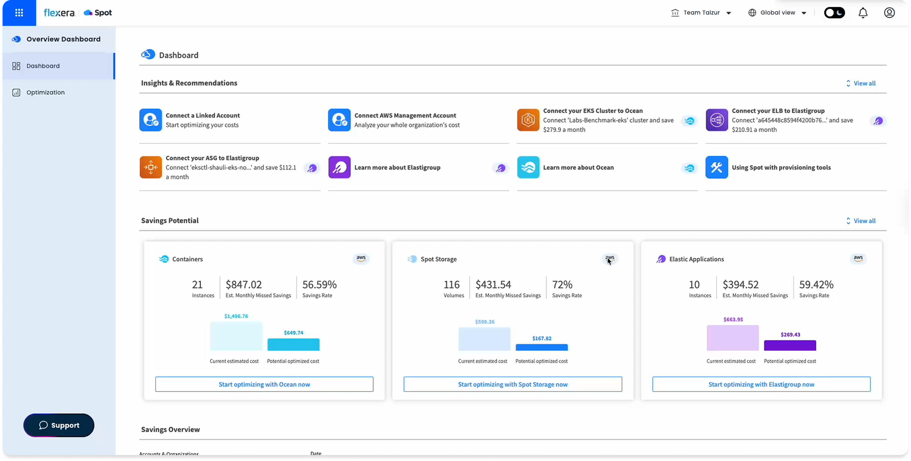
Spot Ocean's dashboard already had a Recommendations section. DevOps, FinOps, and SecOps teams could use it to improve cluster cost, security, and configuration. In practice, almost no one did.
The number came from Pendo: 5% engagement. Not because the feature was hidden, but because when users found it, it didn't give them enough reason to act.
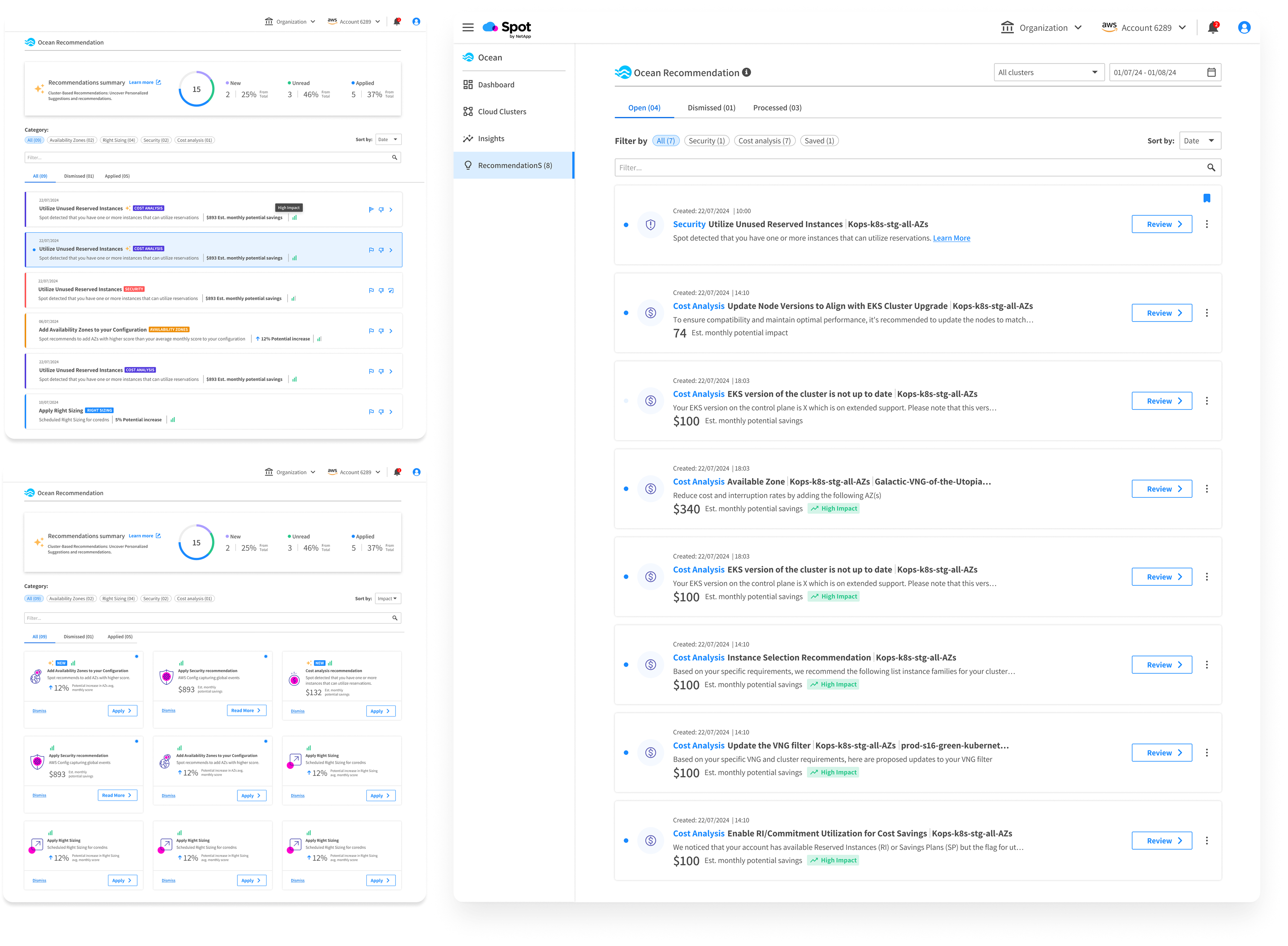
After analyzing session recordings and usage data, a clearer picture emerged. The recommendations felt generic. There was no signal for what each one actually meant, how serious it was, or what you were supposed to do with it. The interface displayed information. It didn't invite action.
The Insight
Users weren't ignoring recommendations. They didn't trust them.
Four friction points emerged from the research. Session recordings were synthesized with AI assistance to surface patterns across multiple sessions faster.
Recommendations were generic. Users couldn't tell if they applied to their specific clusters or not.
There was nothing indicating the potential value or risk of acting. Without that, inaction felt safer.
Recommendations appeared without any instruction. Users didn't know if they could act, how, or whether it was even their responsibility.
Recommendations competed for attention inside a dense dashboard. There was no place to manage them as a whole.
The Approach
From display to management.
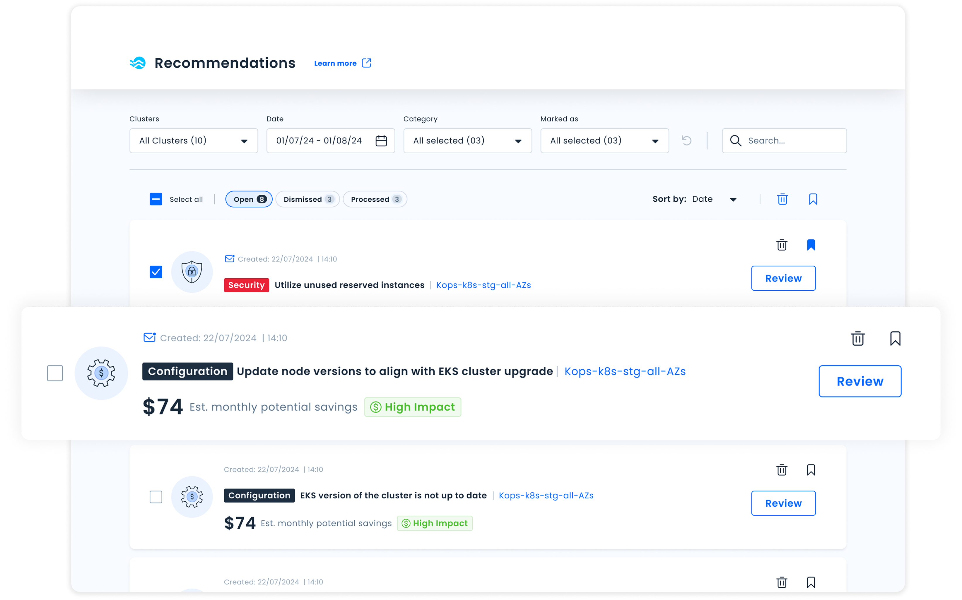
The core shift wasn't cosmetic. This wasn't about redesigning how recommendations looked. It was about rethinking what they were. Instead of a passive list on a dashboard, Recommendations would become a dedicated workspace where users actively manage their optimization backlog.
That meant a new standalone page. And a set of decisions that made every recommendation feel like something you could act on, not just read about.
Every recommendation carries a clear impact level (High / Medium / Low), so users can immediately know what to prioritize.
Recommendations are organized as a backlog: Open, Dismissed, Processed. This turns the list into something you can actually work through.
Each recommendation is a card with a concise summary, impact level, and a defined action: navigating somewhere, triggering a change directly, or simply acknowledging it.
Filters by category, cluster, status, and time, so teams managing many clusters can cut through the noise and find what they need.
Iteration
What we got wrong the first time.
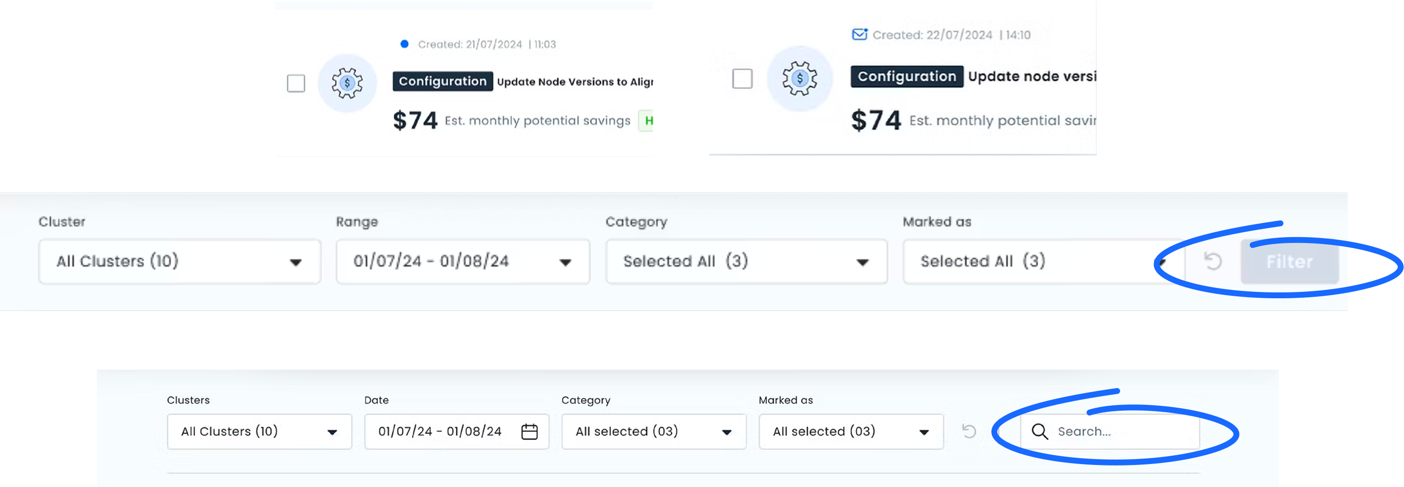
Two rounds of usability testing surfaced friction that wasn't visible in the designs alone. Edge cases were stress-tested with AI to identify failure states before reaching usability testing.
The Filter button was the most significant issue. Users didn't understand they needed to "activate" filters. They expected filtering to happen inline, the way most tools they used worked. We removed the button entirely and moved to direct filter interaction.
The Unread indicator also needed work. The icon wasn't clearly communicating "new since your last visit." We refined the visual and added a tooltip to make the behavior explicit before users had to discover it on their own.
Outcome
The project didn't ship. The thinking did.
Priorities shifted after an acquisition and the feature never reached production. But the design was complete, and so was the measurement plan.
Before the acquisition, we had defined exactly what success would look like:
Page entries and session depth as a baseline engagement signal. Did we fix the 5%?
Filter and search usage rate. Are users cutting through the noise or still overwhelmed?
Action completion rate per impact level. Does surfacing impact actually change behavior?
Dismiss rate as a relevance signal. High dismiss means we're showing the wrong things.
Defining what you'd measure before building is the work. The model we created became the foundation for future recommendation types across the product, without needing a structural redesign each time.