The Problem
It started as a creation form. Then it became the only place users could see what a rule contained.
The Rule Configuration dialog in Spot Ocean's Right Sizing feature controlled how the system recommends and applies resource adjustments across workloads in a cluster. It was one of the most consequential surfaces in the product.
Over time, as the product grew, the dialog did too. New configuration options, new sections, more scroll, more complexity. But when we pulled the Pendo data, we found something more specific than "it's too complex."
Users weren't failing to create rules because the dialog was hard. They were opening it, getting overwhelmed, and leaving. The question was: what were they actually trying to do when they opened it?
The Insight
They weren't trying to edit. They were trying to read.
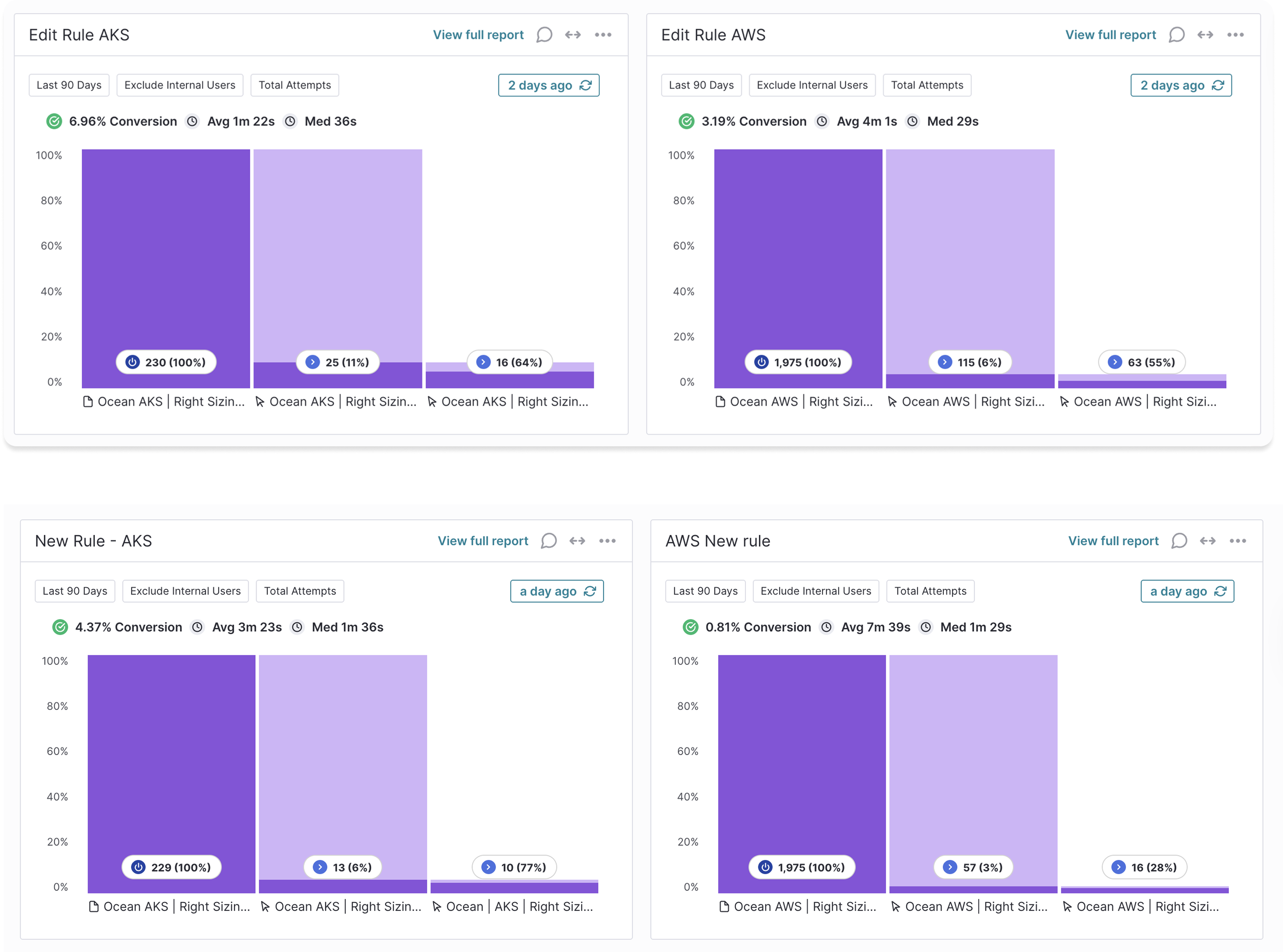
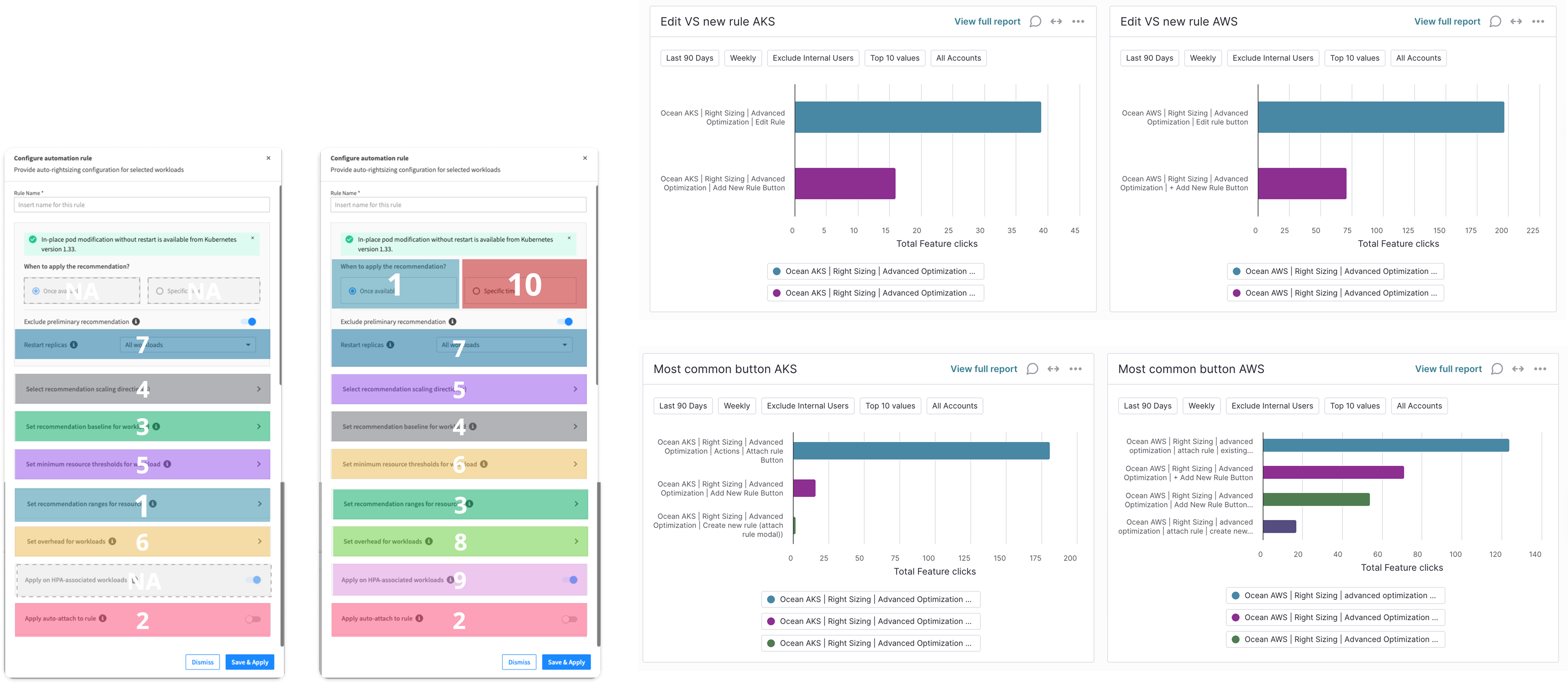
Pendo showed that users opened the edit dialog significantly more often than they created new rules. The ratio was clear across both AKS and AWS environments.
That asymmetry told a story. Teams weren't constantly changing their rules. They were opening the dialog to check what a rule was configured to, because there was no other way to see it. The only mode available was full edit mode, so review and editing happened in the same place, with the same cognitive weight.
The dialog wasn't too complex. It was missing a mode entirely.
The Approach
Separate what you're trying to do from the controls you need to do it.
The data reframed the problem completely. This wasn't about simplifying a complex form. It was about recognizing that users came to the dialog with two very different intentions, and the UI treated them as one.
The research process mapped out what users expected when they opened the dialog, where they dropped off, and which fields were almost never touched. That mapping drove the structural decisions.
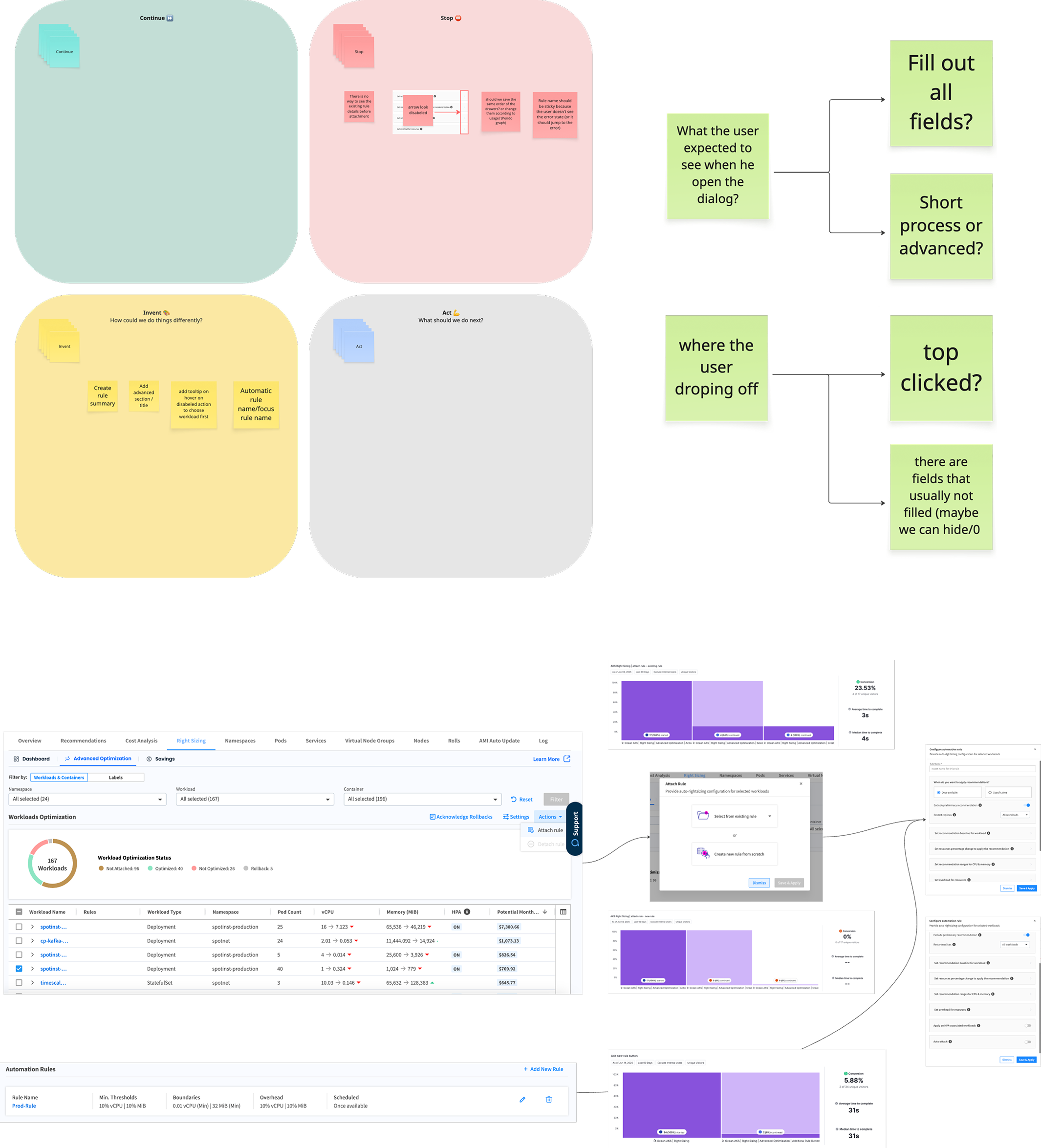
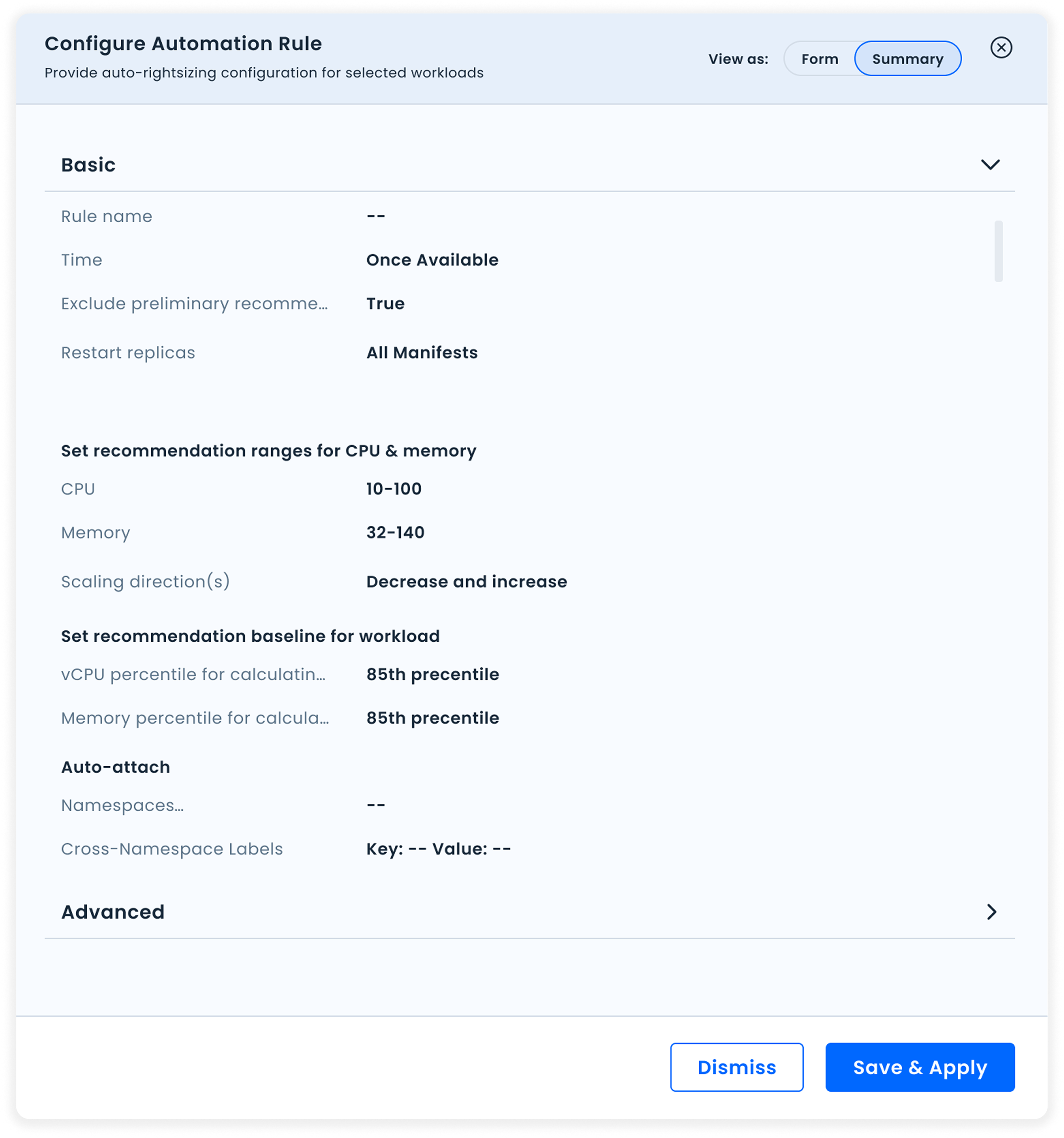
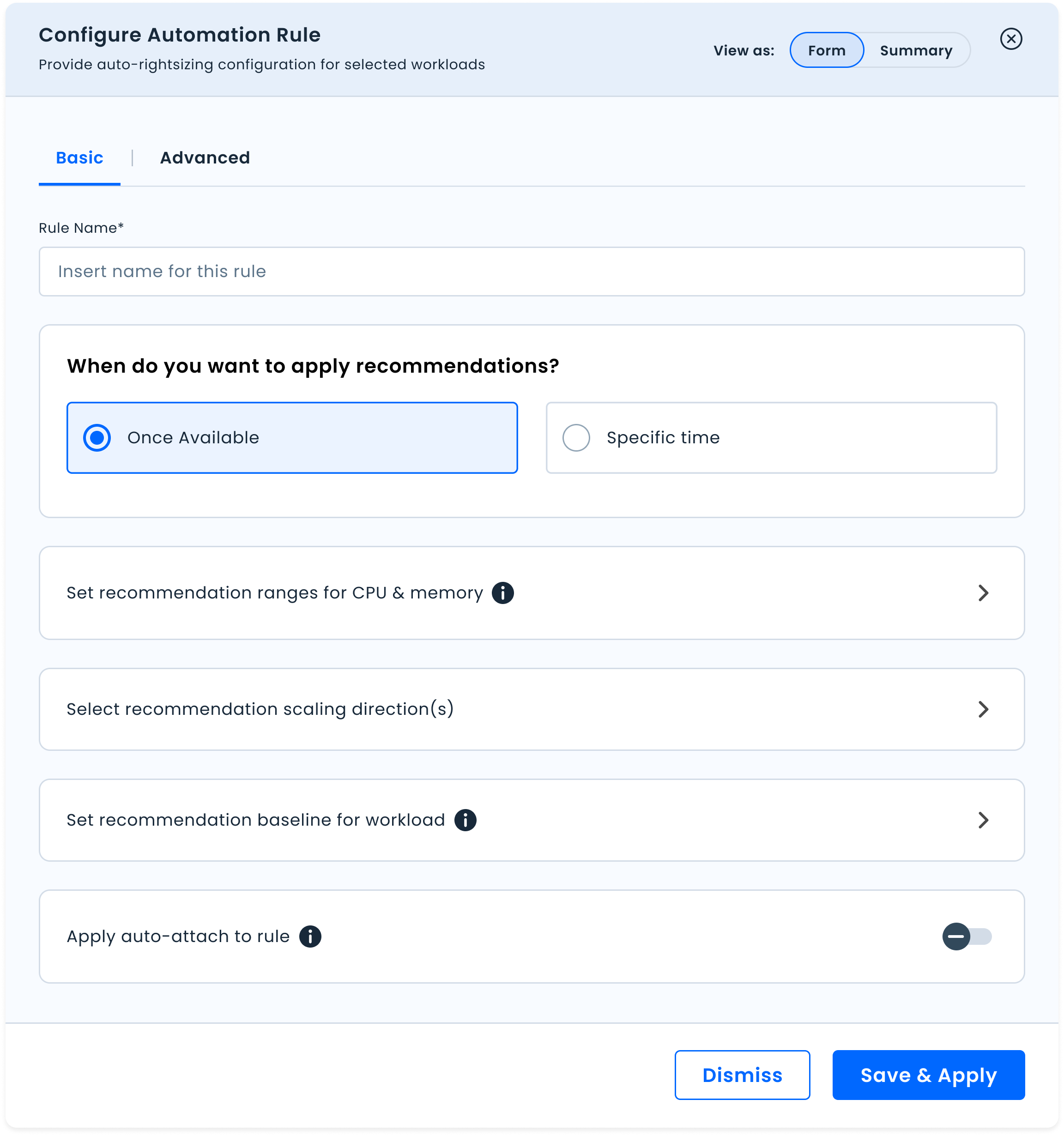
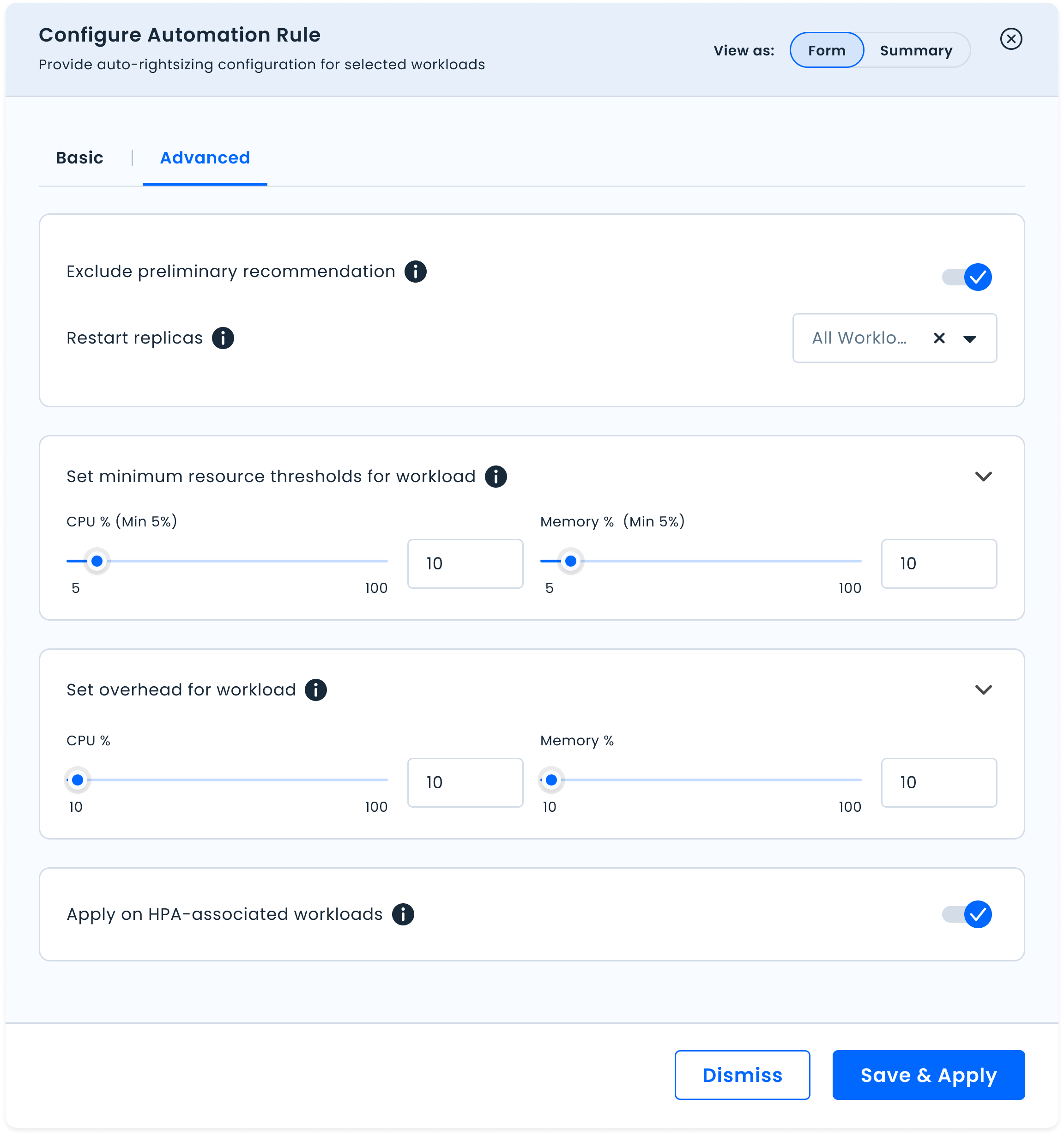
Summary view lets users quickly scan a rule's settings without entering edit mode. Form view is for actual editing: full control, entered intentionally.
Most users only need the core settings. Advanced options are available but don't compete for attention by default.
The most used settings surface at the top. The structure of the dialog now reflects how teams actually use it, based on real usage data, not assumptions.
New settings can slot in without breaking the experience again. The redesign was built to absorb growth.
Outcome
From one overwhelming form to a tool that matches how teams actually work.
The redesign addressed all five pain points identified in the research. The dialog now supports the full range of interactions teams need: reviewing a rule quickly, understanding what it contains, and editing it intentionally.
One mode, for everything. Review, edit, and create all collapsed into a single overwhelming form.
Two modes, each fit for purpose. Summary for understanding. Form for control.
A scalable structure. New settings slot in without repeating the complexity problem.
The redesign shipped. Success metrics tracked time to complete create and edit actions, reduction in configuration errors, and Summary view usage rate as a signal of whether the mode separation was genuinely useful to teams.